

Family Club, Moscow, Russia: Wayfinding and Signage System
Design Positioning: A wayfinding system for an all-ages, family‑friendly sports and leisure center that balances functionality, playfulness, and visual impact, accommodating both children and adults.
Wayfinding and Signage System Design Description
I. Design Philosophy
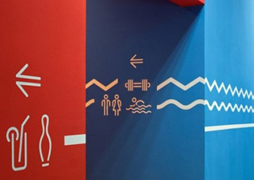
Centered on “Dynamic Visual Navigation with Vitality,” the wayfinding system breaks the functional constraints of traditional sports venue signage by merging navigation with spatial decoration. Through high‑saturation colors, minimalist sports icons, and continuous wall graphics, it ensures clear guidance while enhancing the sense of energy and exploration in the space, conveying a “sport‑as‑play” family‑friendly atmosphere.
II. Core Design Features
Color‑Coded Quick Recognition
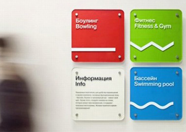
Vibrant red, green, and blue colors distinguish core functional zones: red for bowling, green for the gym, and blue for the swimming pool.
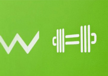
Colors are paired with minimalist geometric icons (e.g., wavy lines representing pool water, dumbbell outlines for the gym), enabling quick recognition of zones without text, reducing cognitive barriers for children and seniors.
Continuous Graphics for Flow Guidance
Dynamic continuous graphics on corridor walls (waves, dumbbells, human‑figure icons) form guiding visual flows, encouraging visitors to naturally explore the space.
This approach transforms wayfinding from isolated signs into “vital decorative elements” of the environment, heightening the immersion and playfulness of the sports experience.
Playful Minimalist Icons
Sports activities are expressed through geometric, minimalist icons (e.g., wavy lines for the pool, dumbbell outlines for the gym), ensuring recognizability while retaining a child‑like charm that fits a family‑oriented sports center.
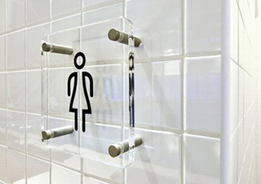
Restroom signage uses transparent acrylic with engraved icons, balancing aesthetics and practicality while maintaining the overall minimalist style.
Multilingual and Inclusive Design
Signage is bilingual in Russian and English (e.g., “Боулинг / Bowling,” “Бассейн / Swimming pool”), serving visitors from diverse backgrounds.
The universality of icons and colors lowers language barriers, allowing users of all ages and language backgrounds to navigate quickly.
III. Materials and Craftsmanship
Wall Graphics: Applied with eco‑friendly latex paint, offering vibrant colors and durability suitable for high‑traffic sports spaces.
Functional Signage: Acrylic with screen printing, providing strong color adhesion and ease of replacement and maintenance.
Restroom Signage: Transparent acrylic with laser engraving, creating a clear, durable finish that contrasts with white‑tiled walls.
Ⅳ. Functional Value
Enhanced Experience: Dynamic graphics and high‑saturation colors turn wayfinding into a lively spatial element, boosting visitors’ enjoyment and exploration, especially appealing to children.
Improved Efficiency: Color coding and minimalist icons significantly reduce navigation effort, helping visitors quickly locate target areas within the complex sports environment.
Brand Reinforcement: The playful visual language aligns closely with the “family‑friendly” brand positioning, strengthening the center’s recognition and memorability


