

Innsbruck Exhibition Center, Austria (Messe Innsbruck) Wayfinding and Signage System
Project Positioning: A wayfinding system for Tyrol’s largest exhibition center in Austria, balancing functionality and visual impact to meet the needs of “large‑scale exhibitions + flexible spaces,” while echoing the Alpine regional culture of Innsbruck.
Wayfinding and Signage System Design Description
I. Design Philosophy
Centered on “Dynamic Geometric Visual Navigation,” the wayfinding system breaks away from the rigid forms of traditional exhibition signage. Through high‑saturation color coding and minimalist geometric symbols, it creates clear visual guidance within the industrial‑style exhibition spaces. It also incorporates Austria’s national colors (red, white, green) and Alpine mountain‑triangle symbols, transforming the signage into a visual medium that links spatial functionality with regional culture.
II. Core Design Features
Strong Recognition Through Color Coding and Geometric Symbols
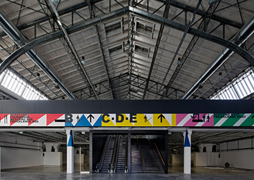
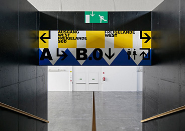
High‑saturation colors – green, red, yellow, blue, pink – distinguish different functional zones: green for “Freigelände West” (West Plaza), red for “Ausgang Süd” (South Exit), yellow for Hall E, and so on. Colors are combined with geometric shapes like triangles and arrows to form strong visual memory points, enabling visitors to identify directions quickly without relying on text.
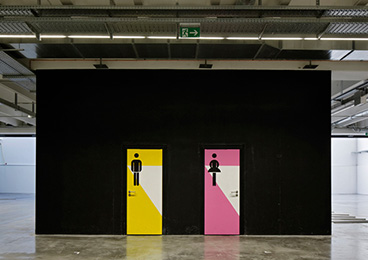
Key functional areas such as restrooms are highlighted through door colors (yellow/pink) and minimalist human‑figure icons, creating prominent visual anchors in large spaces.
Modular Flexibility and Contextual Adaptation
The signage system uses a versatile modular combination of “overhead hanging bands, column painting, wall graphics, and door signage”:
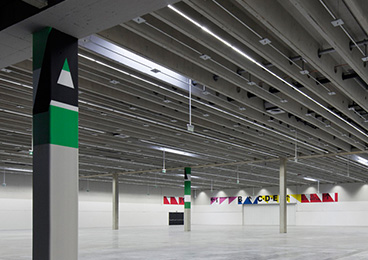
Large Exhibition Halls: Hanging guidance bands extend along the ceiling, using color blocks and letters (A/B/C/D/E) to distinguish hall clusters.
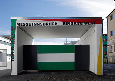
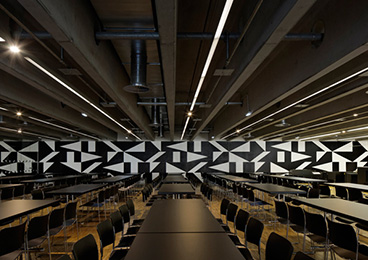
Entrance Areas: Dot‑pattern geometric graphics at the East Entrance and national‑colored (red‑white‑green) portals at the West Entrance reinforce regional identity.
Temporary Exhibitions: Replaceable printed fabrics and acrylic panels allow rapid updates to signage, accommodating the dynamic operational needs of events.
Spatial Storytelling Through Architectural Integration
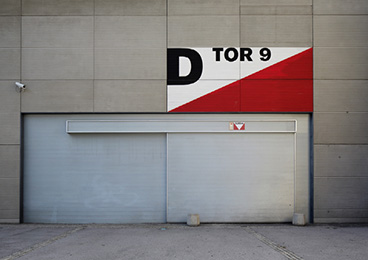
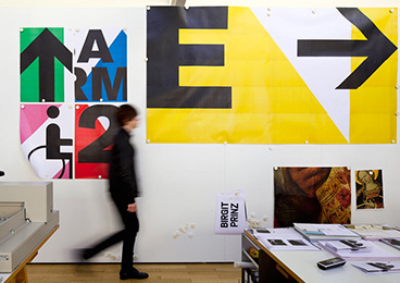
Signage is directly applied to architectural structures: painted color blocks on columns echo the ceiling guidance bands, and oversized wall‑painted letters (D/E) integrate seamlessly with the industrial concrete and metal framework. Beyond wayfinding, these elements become visual decorations that enhance the exhibition center’s modern, energetic image.
The dot‑pattern graphic at the East Entrance simulates the topographic texture of the Alps, while the national‑colored portal at the West Entrance conveys regional culture, making wayfinding part of the spatial narrative.
Multilingual and Inclusive Design
Signage uses German alongside internationally recognized icons (e.g., restroom, accessibility symbols) to serve the diverse visitors of international exhibitions. The universality of colors and graphics reduces language barriers, enabling global visitors to navigate efficiently.
The height and font size of hanging bands are ergonomically considered to accommodate both adults and children.
III. Materials and Craftsmanship
Outdoor Signage: Metal panels + fluorocarbon coating (East Entrance dot pattern), wear‑resistant paint (West Entrance portal), suitable for Austria’s climate.
Indoor Signage: Printed fabric + acrylic panels + metal frames (hanging bands), wear‑resistant paint (column painting), designed for easy replacement and maintenance.
Craftsmanship Details: Text and graphics are produced using screen printing, UV printing, and laser cutting to ensure vibrant colors, clear graphics, and durability in high‑traffic environments.
Ⅳ. Functional Value
Enhanced Navigation Efficiency: Color coding and geometric symbols enable visitors to quickly orient themselves in the vast exhibition spaces, reducing disorientation and improving the event experience.
Strengthened Brand Image: High‑recognition visual language reinforces Innsbruck Exhibition Center’s brand positioning as “modern, dynamic, professional,” boosting commercial competitiveness.
Adaptability for Flexible Operations: The modular design supports rapid adjustments for temporary exhibitions, lowering operational costs and meeting the center’s dynamic operational needs.
Regional Cultural Expression: By integrating national colors and Alpine symbols, the wayfinding system becomes a carrier of regional culture, enhancing visitors’ sense of place and belonging.


