

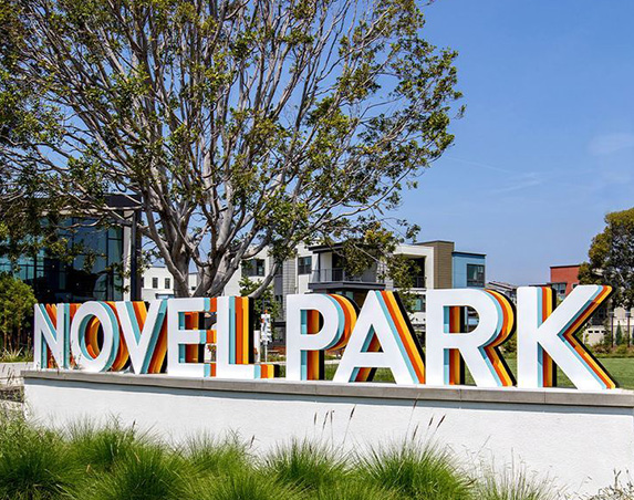
Design Concept
-
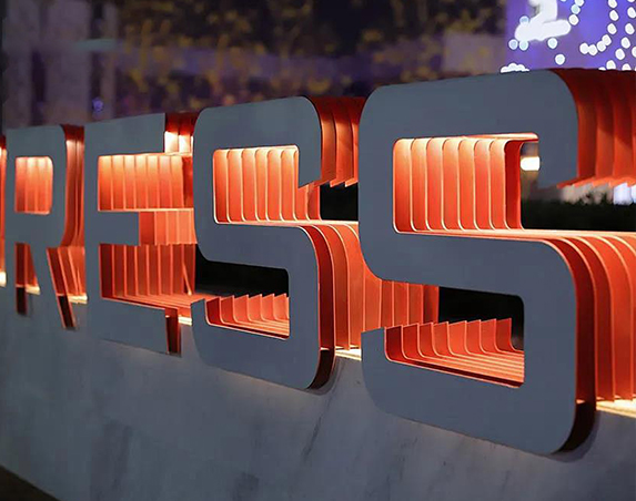
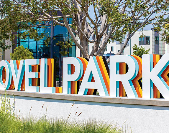
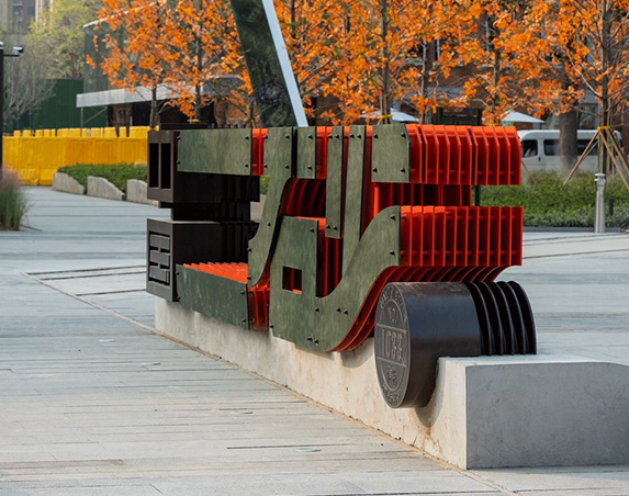
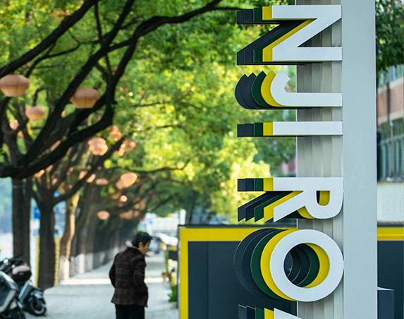
Multi-layer Metal Landscape Dimensional Letters adopt the core design principle of “aesthetics of layering as the core, scene integration as the soul”. Through staggered stacking of metal plates, color contrast and light & shadow arrangement, they break the flatness of conventional signage, creating landscape markers with strong visual impact and spatial ambience. More than just information carriers, they function as art installations within urban spaces. They satisfy the functional demand for brand recognizability, and upgrade the aesthetic texture of the site via material layering and color contrast, perfectly matching the dual requirement of “signage + landscape” for modern commercial, real estate and cultural tourism projects.
- Key Points for Design Optimization
Stacked colors shall align with the project VI system and surrounding landscape palette to avoid color conflict. It is recommended to limit the main colors within 3 types for visual harmony. - Inter-layer gaps shall be adjusted according to letter height: 5–10 mm for letters under 1 m high, and 15–20 mm for letters over 1 m high, balancing three-dimensionality and structural stability.
- Weather-resistant materials such as PVDF coating and 304 stainless steel are required for outdoor projects. Drainage holes are reserved on bases and waterproof glue filled internally for improved windproof and waterproof performance.
- Illuminated versions shall adopt high CRI LED strips. Color temperature shall match outer-layer colors (warm yellow for warm tones, warm white for cool tones) to prevent stray light from disrupting the visual effect.
- Installation positions shall be planned according to landscape sightlines to avoid obstruction by vegetation. Sufficient pedestrian space shall be reserved to guarantee visibility and safety.

Structure & Material Analysis
-
Stacked Structure
Layering logic: Generally composed of 4–8 stacked metal sheets. The outer layer serves as the main visual surface (brand color / primary font); the middle layer is the color transition layer (contrasting / accent color); the inner layer acts as structural support (matte black / dark grey). A staggered gap of 5–20 mm is reserved between layers to enhance three-dimensionality and shadow hierarchy.
Craft: Laser cutting + bending forming. Layers are fastened with hidden bolts or welding. Edges are finely polished burr-free to guarantee structural stability and clean visual presentation of the stacked form. -
Material Selection
Base Materials: Aluminum sheets, stainless steel (brushed / mirror finish), wrought iron and other metal plates are preferred, with thickness ranging from 1.5–3.0 mm to balance structural strength and lightweight design.
Surface Treatment: Outer layers adopt PVDF fluorocarbon coating, PVD vacuum plating or anodizing for long-lasting weather-resistant colors; middle layers are finished with high-saturation paint (orange, yellow, blue, etc.) for visual contrast; inner layers use matte black / dark grey powder coating to deepen spatial perspective.
Illuminated Upgrade: LED linear light strips can be embedded in some inner layers. Light gently spills out from gaps between layers to form gradient halos at night, improving night-time recognizability and atmosphere. -
Mounting Base
Material: Paired with stone (marble / granite), concrete, metal frames and other bases to harmonize with surrounding landscape materials.
Structure: Letter shells are fixed to the base with hidden brackets. Outdoor versions are treated for waterproofing and rust prevention, with access openings reserved for later maintenance. - Stacked colors shall align with the project VI system and surrounding landscape palette to avoid color conflict. It is recommended to limit the main colors within 3 types for visual harmony.
- Inter-layer gaps shall be adjusted according to letter height: 5–10 mm for letters under 1 m high, and 15–20 mm for letters over 1 m high, balancing three-dimensionality and structural stability.
- Weather-resistant materials such as PVDF coating and 304 stainless steel are required for outdoor projects. Drainage holes are reserved on bases and waterproof glue filled internally for improved windproof and waterproof performance.
- Illuminated versions shall adopt high CRI LED strips. Color temperature shall match outer-layer colors (warm yellow for warm tones, warm white for cool tones) to prevent stray light from disrupting the visual effect.
- Installation positions shall be planned according to landscape sightlines to avoid obstruction by vegetation. Sufficient pedestrian space shall be reserved to guarantee visibility and safety.
Application Scenarios
Real Estate Projects: Branding pylons at sales centers, residential entrance signage, landscape node markers in gardens to lift the premium quality of projects.
Commercial Blocks: Commercial street entrances, theme plazas and signage for trendy stores to draw foot traffic and strengthen block memory points.
Urban Public Spaces: Wayfinding signage for city parks, cultural and creative parks and art centers, acting as art installations within the space.
Cultural & Tourism Projects: Signage for scenic entrances, theme parks and homestead clusters, integrating local culture with modern aesthetics.
Dual Experience for Day & Night
Daytime: Color interplay and staggered layers of multi-layer metal become the visual focus. Natural shadows form between layers under sunlight, amplifying the three-dimensional effect and blending harmoniously with landscape elements such as greenery and buildings.
Nighttime: For illuminated versions, inter-layer halos diffuse softly, and color layers gain better rhythmic sense under lighting. It ensures sign recognizability while creating an elegant night-time ambience.
Key Points for Design Optimization
- Material selection shall match the project VI system and facade materials to avoid style inconsistency.
- Font proportion shall fit the viewing height of installation locations. For outdoor signage, letter height of no less than 60cm is recommended for long-distance readability.
- Outdoor projects require enhanced waterproof and anti-rust treatment: waterproof glue filled inside letter shells and drainage holes reserved on bases.
- Adopt high CRI, low-power LED strips to extend service life and cut maintenance cost.
- Installation positions shall be planned according to sightlines of the landscape to avoid blockage by plants, with sufficient space reserved for maintenance.


