

Selfridges & Co. London: Wayfinding and Signage System
Design Agency: Cartlidge Levene, UK
Project Positioning: Creating a wayfinding system that blends modernity with historical warmth for the century-old high-end department store on London’s Oxford Street, aligning with its brand identity as a “creative retail landmark.”
Wayfinding and Signage System Design Description
I. Design Philosophy
Centered on “Invisible Elegant Guidance,” the wayfinding system carries forward Selfridges’ pioneering retail DNA. Through minimalist visual language and transparent materials, it establishes clear and refined navigation without compromising the classical beauty of the century-old architecture. The system acts as an “invisible supporting element” rather than a visual focal point.
II. Core Design Features
Aesthetics of Transparency and Discretion
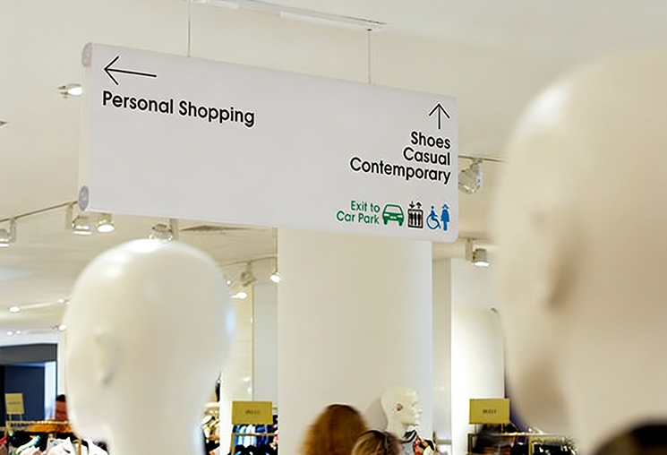
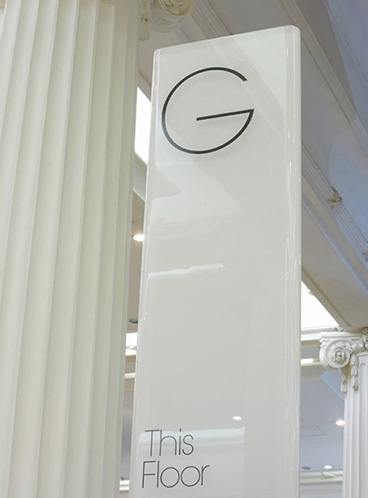
Using ultra-transparent acrylic and back-painted glass as the primary carriers, the signage visually blends into the building’s white colonnades and bright atriums. Information is conveyed solely through black lines and colored icons, preserving the classical elegance of the historic architecture to the greatest extent.
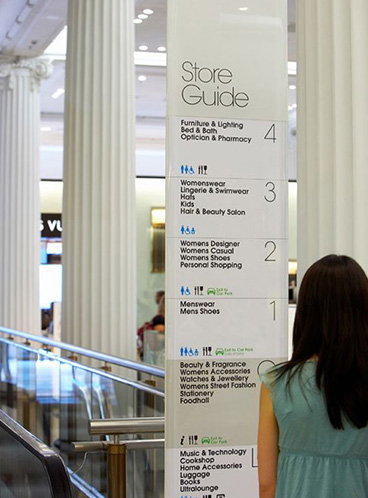
The “G” (Ground Floor) marker on freestanding signs features minimalist black lines, creating a dialogue between modern design and historical architectural elements.
Soft Colors and Logical Hierarchy
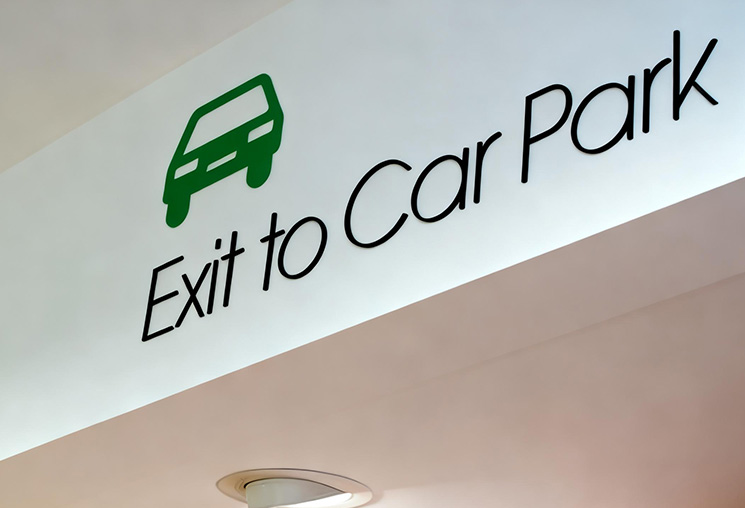
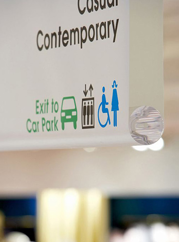
The color palette revolves around “white + black + low-saturation hues.” White serves as the base for signage, black text ensures clarity, and colored icons—such as green (parking) and blue (restrooms)—act as visual anchors for functional zoning. These colors stand out yet remain unobtrusive in the bright commercial environment.
Clear Information Hierarchy:
Floor Landmarks: Freestanding transparent signs display floor numbers and functional area lists (e.g., “Womenswear,” “Menswear”) alongside floor maps for quick orientation.
Functional Guidance: Hanging or wall-mounted signs use icons and arrows to distinguish facilities like restrooms, escalators, and parking.
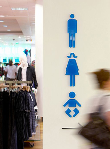
Wall Signage: Three-dimensional blue human-shaped icons (adult, child, accessible) are crafted from acrylic engraving, balancing functionality and design appeal.
Inclusivity and Multi-Scenario Adaptability
Signs combine English text with universal icons to accommodate global visitors. Restroom signage includes icons for adults, children, and accessibility, reflecting consideration for diverse needs.
The installation height and font size of signs are ergonomically optimized for both adults and children, while also avoiding obstruction of the building’s classical decorative details.
Material and Craftsmanship Quality
Primary Materials: Freestanding signs use ultra-transparent acrylic with a back-painted, high-gloss finish, reflecting the surroundings while ensuring legibility. Indoor signs employ matte acrylic with UV printing for a tactile, durable feel.
Craftsmanship Details: Text and icons feature laser engraving and paint-filling for strong color adhesion. Edges of transparent signs are finely polished, enhancing the modern minimalist aesthetic.
III. Functional Value
Spatial Harmony: Transparent materials and minimalist design allow the wayfinding system to coexist harmoniously with the classical architecture, meeting commercial navigation needs without disrupting the historical ambiance.
Enhanced Experience: Soft colors and clear information hierarchy improve navigation efficiency for shoppers in the complex department store environment, while conveying Selfridges’ upscale and elegant brand tone.
Brand Reinforcement: The modern wayfinding language aligns deeply with Selfridges’ “pioneering retail” positioning, creating distinct visual memory points and strengthening the store’s commercial competitiveness.


