

HANA·BIYORI: The New Sensory Flower Park at Yomiuri Land
I. Design Philosophy
Centered on “Invisible Guidance in Harmony with Nature,” the wayfinding system serves as a gentle connection between the park and its visitors. It fulfills functional guidance needs without compromising the beauty of the natural landscape, allowing signage to blend into the environment rather than standing out as intrusive elements.
II. Core Design Features
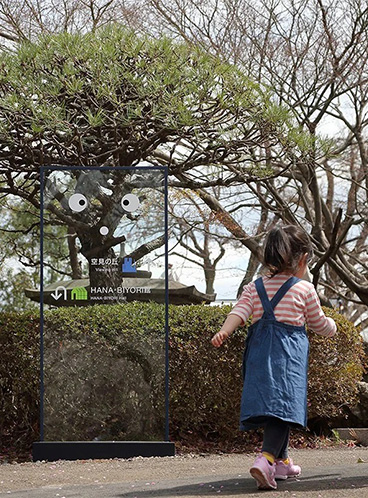
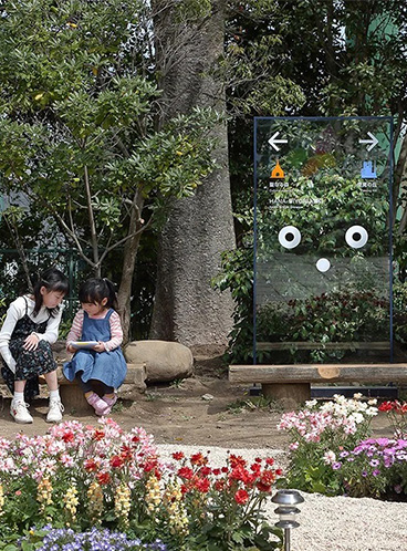
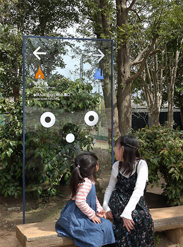
Transparent Visual Discretion
Using ultra-transparent acrylic as the main material for signage, paired with slender black metal frames, the signs “disappear” amidst flowers and trees, conveying information solely through white text, arrows, and emoticons.
This design allows visitors to see through the signage while fully appreciating the plant scenery behind, achieving seamless integration of wayfinding and nature.
Personalized Emotional Connection
The “eyes + mouth” emoticons on the signage give the signs a lively, personified feel, fostering emotional resonance with children and family visitors and making the park exploration process more engaging.
Indoor signage (e.g., “Kawauso Biyori”) features rounded animal icons and handwritten fonts, extending the park’s theme of “new sensory experiences” and creating a warm, friendly atmosphere.
Modular Information Hierarchy
The signage adopts a uniform vertical rectangular module, with colors (orange, blue, green) distinguishing different functional areas (entrance, exhibition halls, gardens). Variations in arrow and text sizes clarify information priority.
All signage installation heights are ergonomically considered to ensure readability for both children and adults.
Material and Craftsmanship Adaptability
The main material is weather-resistant acrylic with an anti-glare surface treatment, ensuring clarity even under strong outdoor light. Metal frames are rust-proofed to withstand the park’s humid environment.
Text and patterns are printed using UV technology, offering long-lasting color and wear resistance to maintain visual consistency over time.

III. Functional Value Enhanced Experience:
The transparent design and personalized details transform wayfinding from cold directives into an integral part of the park’s immersive experience, elevating visitors’ exploration enjoyment.
Nature Preservation: The “discreet” design of the signage preserves the integrity of the natural landscape to the greatest extent, aligning with the park’s positioning of “new sensory floral experiences.”
Brand Consistency: Unified visual language from indoor to outdoor spaces strengthens HANA・BIYORI’s brand recognition, creating cohesive memory points for visitors as they move through the park.


